BIOSENSE Desktop
The Biosense device is a medical grade, clinically validated, mobile-compatible breath ketone tracker that provides users with a full picture of how fat burn levels change throughout the day based on diet, activity, and fasting. It pairs with a health tracking app to help users monitor fat burn efficiency through two primary metrics — Active Minutes and Ketone Levels (ACEs).
Duration
Aug 2021 - Aug 2024
Role
UI/UX Designer
Tools
Figma, Illustrator, Photoshop
Skills
Prototyping, Experience Design, Design Systems
Background
Biosense’s mobile app gives users quick daily insights and high-level trends related to their metabolic health. While this lightweight experience works well for on-the-go tracking, mobile inherently limits how much historical data and comparative analysis users can easily access.
To better support users who want to explore long-term patterns or make deeper data-driven decisions, Biosense began developing a desktop experience. The intention was to extend the mobile ecosystem—not replace it—by offering a larger canvas for visualizing data and understanding metabolic performance over time.
challenge
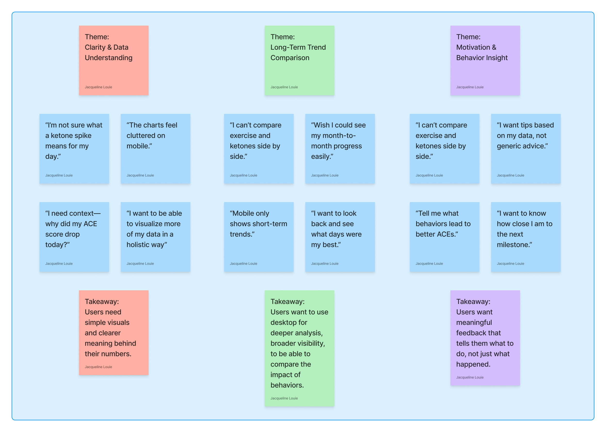
Although the mobile app encourages consistent engagement, user research revealed several unmet needs:
Difficulty comparing long-term trends across activity and ketone data
Limited ability to view metabolic performance holistically in one place
Lack of clarity around how daily behaviors influence overall metabolic health
This led to the core design challenge:
👉 How might we create a desktop dashboard that clearly and interactively visualizes metabolic performance, while maintaining Biosense's approachable, science-driven brand identity?
What is mobile good for?
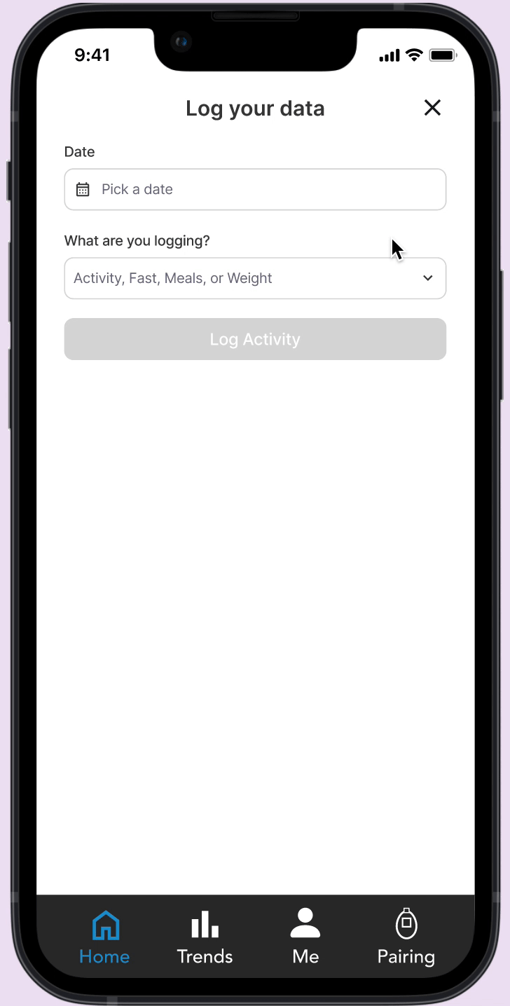
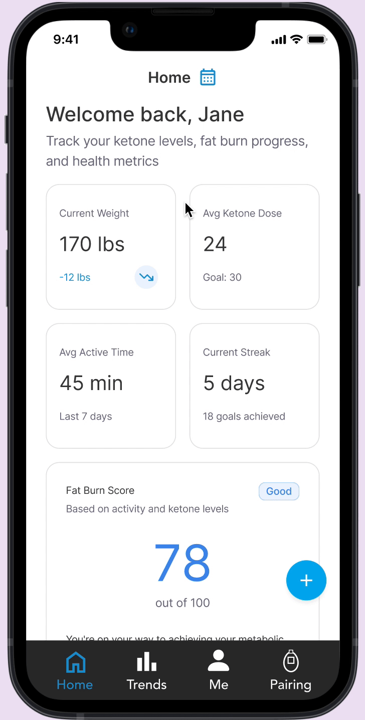
The mobile app is great for quick, on-the-go tasks. Users can take readings, log behaviors, and check their daily score easily, making it ideal for fast feedback and habit reinforcement.
What is mobile Lacking?
Mobile falls short when users want deeper insight. It’s difficult to compare long-term trends, view multiple data sources together, or explore patterns on a small screen, limiting meaningful analysis.
Research / User Interviews / Stakeholders
Participants
6 mobile app users who actively track daily ketones and exercise
2 Biosense coaches (stakeholders)
1 data scientist (stakeholder)
Key Insights
Users wanted a quick-glance overview (daily score) and deep dive views (trends and activity breakdowns).
Data visualization needed to balance simplicity and scientific accuracy.
Desktop users prefer larger comparative visuals (charts, score histories) over scrolling summaries.
Stakeholders emphasized maintaining consistency with mobile app visuals, while introducing more data transparency.
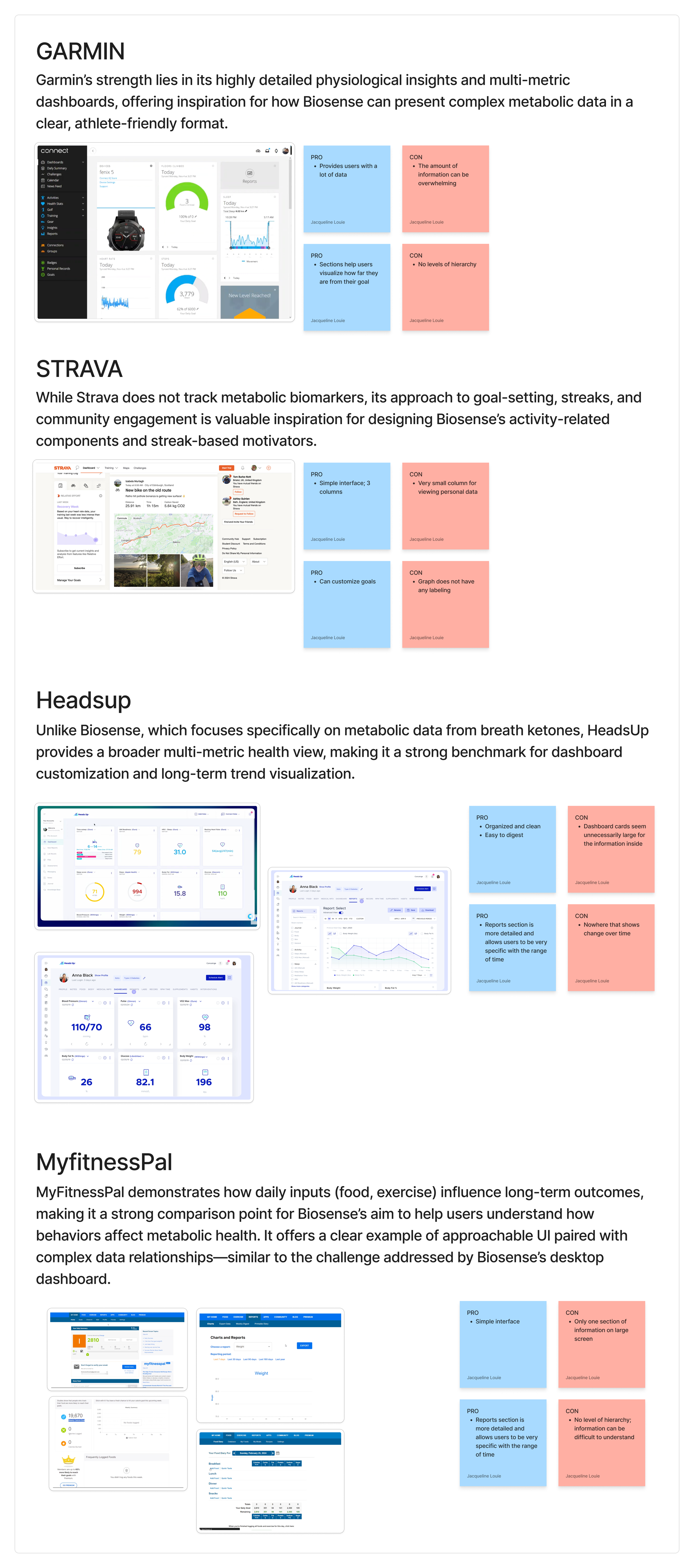
Competitive Analysis
Design Iteration
Round 1
Ported mobile cards (Fat Burn Score, Active Minutes, Ketone Levels) into larger dashboard tiles.
Users found it familiar but lacked clarity on data relationships.
Round 2
Introduced interactive visual hierarchy:
Top: Daily Fat Burn Score
Middle: Supporting metrics (Active Time, Ketone Levels)
Bottom: Long-term Trends
Added contextual tips for improving metabolic health.
Round 3
Simplified layout with a clear navigation sidebar (Dashboard, Trends, Settings).
Optimized for desktop reading flow — scanning left-to-right, top-to-bottom.
Integrated a visual breakdown of activity vs metabolic fat burn using color coding (orange = activity, blue = metabolic).
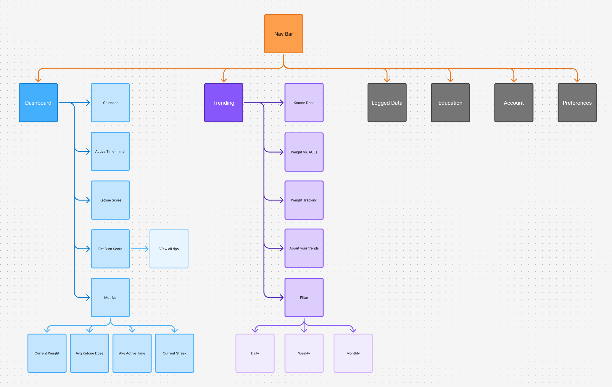
Information Architechture
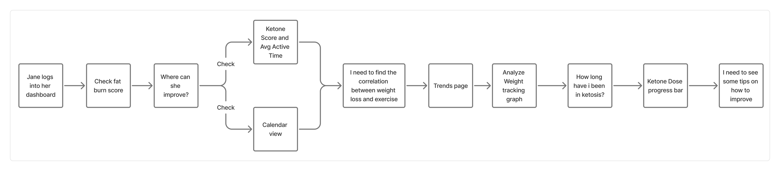
User Journey / Workflow
Final Design
Hover Over GraphS
Interactive hover states reveal precise values and context without crowding the interface, allowing users to explore patterns and details only when they need them.
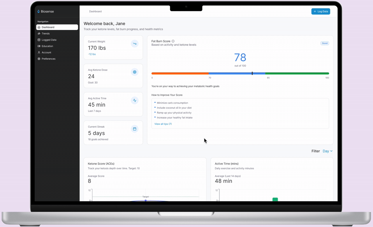

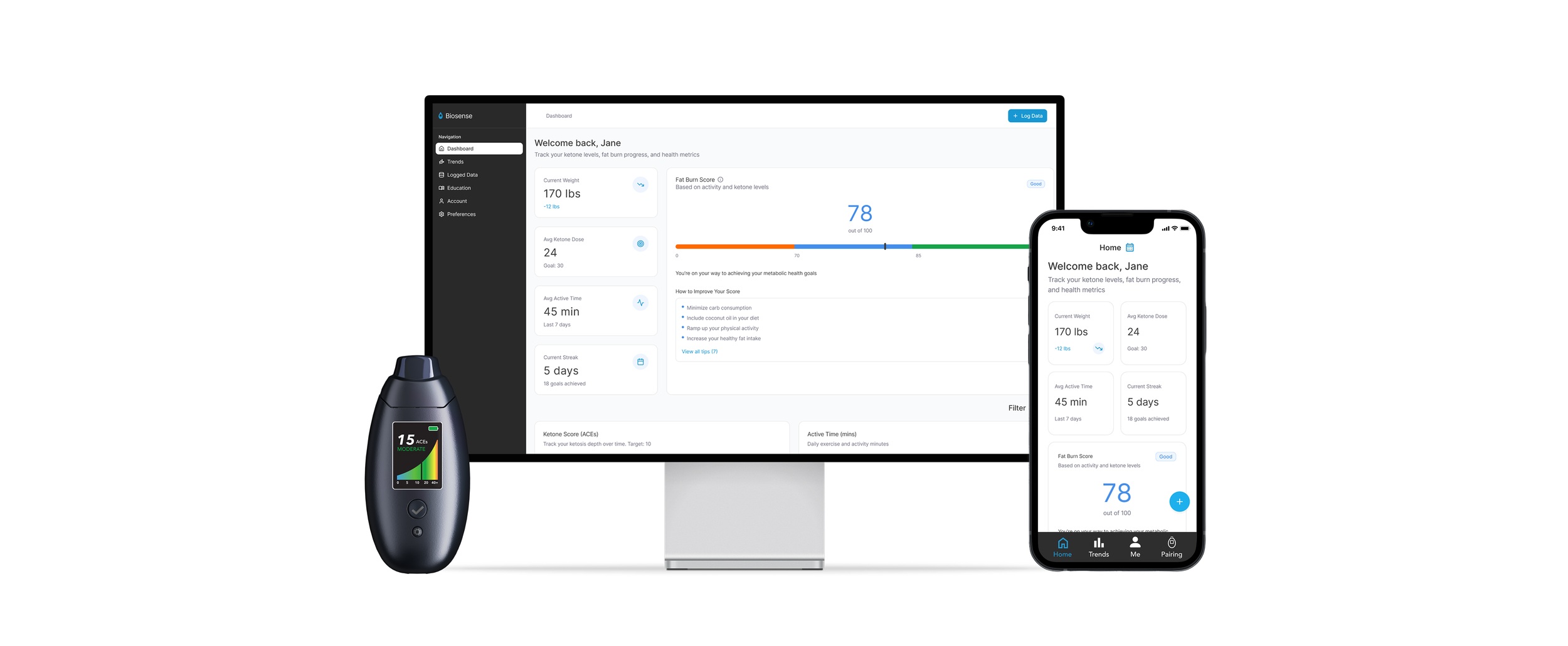
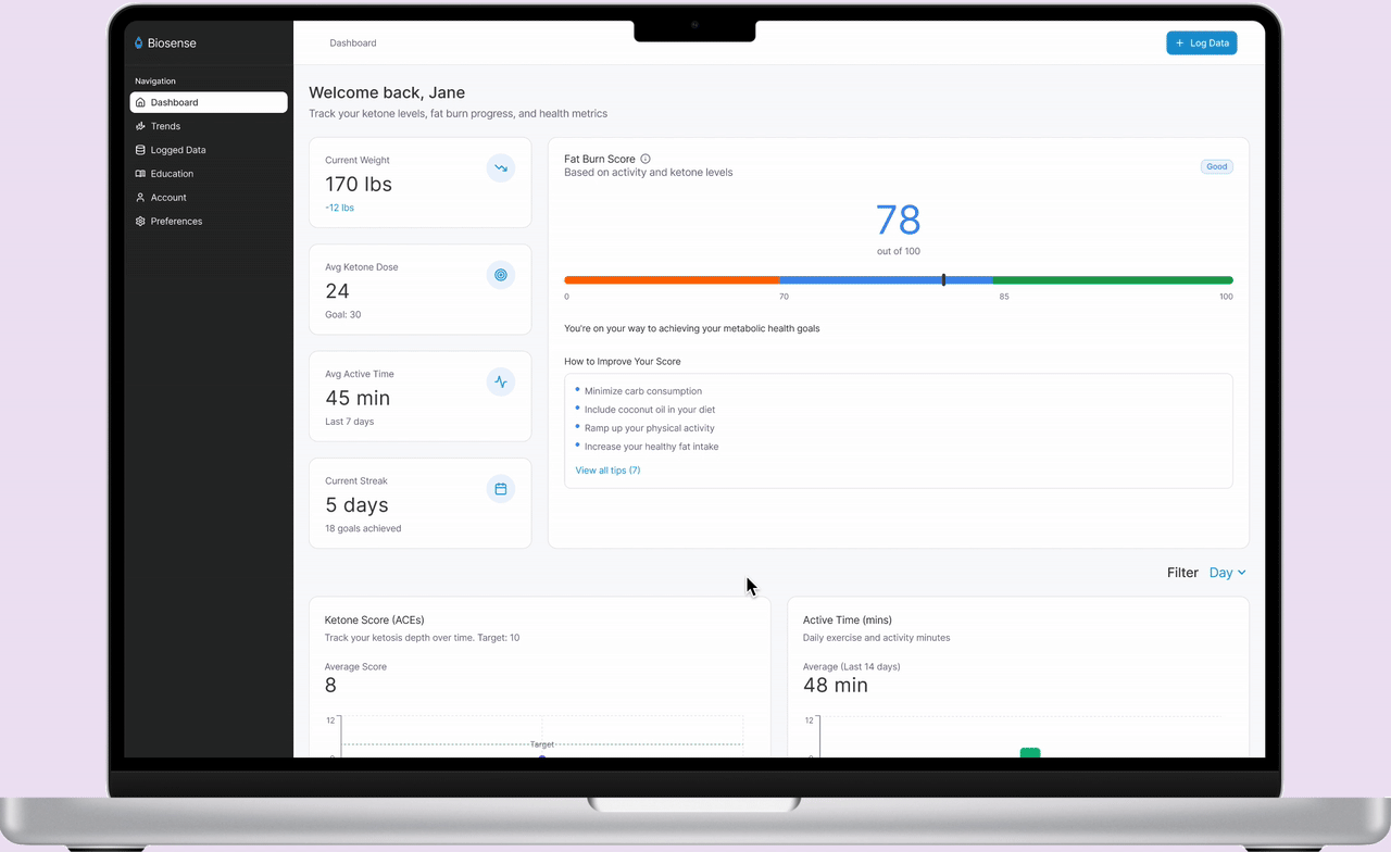
Desktop Dashboard
The desktop dashboard brings all metabolic data into one clear view, making long-term trends and comparisons easy to explore. It expands beyond mobile’s limitations with a spacious layout designed for deeper analysis.
Trends section
The Trends section highlights meaningful shifts over time, helping users quickly spot progress, correlations, and long-term patterns in their metabolic data.
RESULTS & KEY TAKEAWAYS
Ultimately, the project reinforced that users don’t just want data—they want understanding. Creating a desktop dashboard allowed us to transform individual readings into clear narratives, helping users connect daily choices to long-term metabolic progress.